The Orlando Magic’s 2021 City Edition jerseys work to combine the old pinstripes and font with the new look the Magic use. . . and orange.
When Nike announced a new approach to the NBA jersey set, promising each team an alternate plus a creative outlet with a City Edition jersey to reflect each city’s unique history and style, it was not clear just where teams would take them.
Some styles were bold and loud, others more reserved. Some jerseys worked and plenty of others did not.
No one could fault the Orlando Magic for being willing to try something new. Their space-print jerseys were very different and a bold change to the team’s look. They scaled it back for their second City Edition jersey — leaving the space print for side paneling.
Last year’s look was a bit bolder.
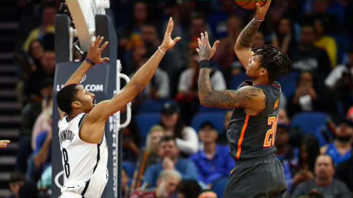
The team decided to pay homage to the citrus industry that defined Central Florida and was the namesake for the county Orlando is located in. They added orange to their color palette with a gray (officially anthracite) jersey emblazoned with O-R-L across the chest. It came complete with a court with the same color scheme.
Nobody would fault the Magic for trying something new, even if all three jerseys were met with some mixed reviews.
Their latest effort is a continuation of their orange look from last year. But instead of trying something new, the Magic have gone back to the well.
Hello, pinstripes. Hello, original star font. Welcome back, orange.
https://twitter.com/OrlandoMagic/status/1326181190001455104
The Magic opted with their 2021 City Edition jerseys to combine the old and the new.
The team is using its pinstripe design used in the Association and Icon Edition jerseys (the team’s regular home and road jersey set) and mixing it with the team’s beloved original font with the star as a nod to the team’s original logo and jersey design. The whole print is in orange to continue the orange theme the Magic have been going with their City Edition jerseys.
Overall it is a great homage to the team’s past while continuing to celebrate the team’s future and heritage.
If you are a fan of the idea of going orange for these alternate jerseys, then this jersey is right up your alley. It is hard to find any Magic fans who dislike the team’s original font or jersey style. And this pays proper homage to both.
If you are not a fan of the idea of going orange, this probably is not your style. But still, nobody will complain about the Magic going back to their traditional font or pinstripe uniforms.
As SportsLogos.net and Conrad Burry played around with the design, it’s color opposite is a pretty solid traditional look for a Magic jersey — and would undoubtedly be a solid seller, just saying.
https://twitter.com/conradburry/status/1326191191331901440
When going with a completely new color design, there is always the chance to go overboard. The thing that probably saved last year’s design was its simplicity.
When rumors came out that the team was going to wear some orange-themed jersey, there was a fear it would be a loud and bright orange uniform. So the understated anthracite and orange look was a welcome surprise. And the jerseys did grow on people after initially perplexing some people.
This design is much clearer and its inspirations much more traditional. Doing an orange look for the Magic’s traditional jerseys is a much more expected look. This combines all the ideas the Magic have had for their jersey well.
So far the reception from the fan base seems to be going well. The reviews are overall positive.
The jerseys will go on sale on Dec. 3 at the Orlando Magic’s team shop and online.
The good news too is Nike is bringing back the Earned Edition jersey after giving only warmups to playoff teams last year. So the Magic, as a playoff team from last year will get one more jersey for the 2021 season.
What do you all think?
