Trying Something New
While there were some abject failures in the Orlando Magic’s jersey sets. There were at least a few good attempts to try to update the team’s look and make it look more modern.
There was not recapturing the vibe of the Magic’s original uniforms. Those were definitely products of the 1990s. But the team has been willing to admit that pinstripes in some form are part of its legacy.
In the process, the team has been willing to try some new things to make the jersey stand out. At least a few of them got mixed results.
12. 2018 Original Space City Edition
Nike had a bold vision for the NBA’s jerseys. Partly as an attempt to try to sell more jerseys, they changed how teams picked their jerseys and what kinds of jerseys they would wear. The idea of having an ever-rotating alternate jersey was something very new.
There were plenty of hits and misses in that first year. The Miami Heat’s Vice Jersey and Minnesota Timberwolves’ Prince jerseys were among the boldest and most successful. The first attempt for the Magic?
Well, it was OK. It was bold and different. An attempt worth applauding for its originality, if not for its success as a design.
The Magic would pay homage to the space industry that sprung up in Central Florida by printing the team’s secondary logo across a space background. The Magic would literally be wearing the stars they have used in their logo for several years.
The jersey did not sink in as much as they hoped. It was not the most successful of the City Edition jerseys. It looked better in action than it did on paper.
But these jerseys largely did not work.

11. 2020 Statement Edition Blue
The Orlando Magic made one of the biggest changes to its uniform set this year. Not only in introducing the Orange City Edition jersey they will debut Friday, but also in getting rid of their traditional blue road jersey in the new pinstripes format.
The new Statement Edition jerseys are fairly clean. They maintain the look of the traditional blue pinstriped uniforms the Magic have worn since the 2009 season but eliminate some of the clutter of the pinstripes. The blue color is bright and clean and stands out.
This is a good jersey base, at the very least.
The rest of the design is truly in the eye of the beholder. The stars on the side pants with the cascading black pinstriped sashes are a different look. It is not to my favor.
There is a lot to like about this jersey, but it is truly not universally enjoyed.

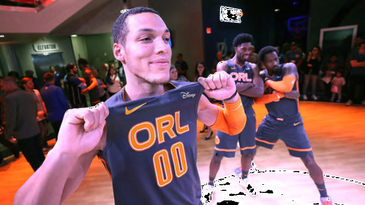
10. 2019 Space City Edition Version 2
The Orlando Magic’s second attempt at a City Edition was much more muted than its first attempt.
Gone was the team’s space print, replaced with a much plainer black jersey. The space print still went down the side paneling. And it actually kind of worked.
The simpler black background brought the print of the Magic’s secondary logo across the chest out. It made the whole jersey stand out a lot more. It was sleeker and nicer in so many ways.
The jerseys were still fairly boring and simple. The secondary logo still draws some criticism. Especially when it is left alone on the jersey front.
The Magic have stayed pretty quiet with their City Edition jersey designs. They have kept things fairly simple — the color splash this year is the boldest thing and the jersey is still grayish.
But for a second attempt and a riff of the original City Edition jerseys. This was a good first step and a bit of an improvement.

9. 2009-2019 New Pinstriped Blues
8. 2009-Present New Pinstripe Whites
The Orlando Magic opted to change their jerseys before the 2009 season, hoping to create an updated version of their pinstripe uniforms. It was mostly successful. The team’s look felt better than the previous plain jerseys.
But the jerseys were still not quite well-received. They reminded everyone of the beloved original pinstripe jerseys. The font was a bit too futuristic and did not quite fit. Fans still clamor for a new jersey or new logo design to update the team’s look.
This was a good update at the time. And still remains a solid look for the team. A mix of the old and the new. Although it could still use some tweaks.
When it comes to the jersey design, the blue ones felt like the most normal of the group. And that might be why they eventually got relegated to alternate road jersey (replaced with the black uniforms) and are not out of the jersey rotation entirely.
The white jerseys feel a little better. The pinstripes are more pronounced as the gray offsets the white well. And the side-piping works better against white rather than blue.
