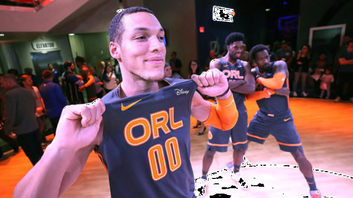
The Orlando Magic unveiled their City Edition uniform. The much-talked-about orange uniform stayed safe with the team’s color change.
The moment the rumors started about the team’s idea for its new City Edition uniforms leaked out, it was easy to let things go wild.
The team has not been too crazy with its jersey design in its history. The pinstripes were a bold and iconic choice in the late 80s and early 90s, but each iteration since then has been pretty conservative.
The current jersey set is a callback to the throwback uniforms, but still pretty simplistic in its design. Simpler is better when it comes to the jersey.
Since the switch to Nike, it kept a relatively conservative design of the primary Orlando Magic logo across the chest with a star print for the base as an honor to the aerospace industry in Central Florida. Using that star print was a bold choice to mix up the regular design.
But the Magic did not go too outlandish or far outside their color scheme.
The idea of honoring the citrus industry or orange, an integral part of Central Florida from the name of the main thoroughfare through Downtown Orlando and even the name of the county Orlando resides in, quickly reached for outlandish ideas.
Full orange jerseys with alternate logos were quickly designed and submitted to the Internet for review.
Ultimately, the Magic kept things conservative. Giving the nod to a new color scheme but keeping things pretty basic nonetheless.
The Magic’s new City Edition jerseys were unveiled Thursday. They do indeed have orange in them, marking the first time the team has worn anything aside from its usual white, black and blue palate.
Against an Anthracite Gray (a Nike-favored color, just ask the UCF Knights) jersey, “ORL” is spelled out in orange with orange numbers and orange trim on the pants. It is a nice nod and a solid, but conservative look.
The jerseys will make their on-court debut the day after Thanksgiving on Nov. 29 when the Orlando Magic host the Toronto Raptors.
The uniform is not about to win any critics’ choice awards. The uniform is pretty basic. The contrast between orange and the blackish gray Nike chose is a solid one. It is not garish or terrible to the eye.
It does not evoke any of the Magic’s past uniforms. It is truly unique in that way. If not a bit simple for the supposedly bold ideas of the City Edition jersey.
This is not anything crazy. So perhaps the jerseys were not worth all the hype and anticipation — or maybe the team will look to evolve them in some way for next year’s City Edition jersey.
If there is any small complaint it is that the hype video takes to calling Orlando the O-R-L (the lettering on the jersey itself). I am not sure anyone calls Orlando that — the 4-0-7, maybe, but that name is already taken by the team’s co-ed hip-hop dance crew.
But maybe that is just marketing. The jersey is something different and is a bold color choice. It does not go too far beyond that.
With the Magic also set to debut an orange-themed court, which was not announced with the jerseys at the season ticket holder event Thursday at the NBA Experience at Disney Springs, it will be interesting to see how they look in action.
The orange-themed court — accidentally leaked for a moment by Terrence Ross on Instagram, which he then quickly denied once it left his Instagram story — will feature a black lane with orange lettering on the baselines and the orange ORL seen on the jerseys at center court.
Perhaps these jerseys are not the big reveal or the big change fans thought they might see when the orange-themed jerseys leaked.
It is certainly not what I expected — I was expecting to see the team come out in some bright orange jersey. But then again, that could have quickly gone off the rails. That kind of a jersey could have been easily panned as terrible or trying to do too much.
These jerseys might be accused of trying to do too little. It is at least a test of whether fans will respond to a significant color scheme change. And whether fans will take to buying other merchandise like t-shirts to explore newer, more bold designs. They could always look to inverse the jersey for next year’s edition and give the team and fans the bright orange look they want.
These jerseys are not about to go down with some of the best City Edition jerseys. It is hard to see these connecting with fans in the way the Utah Jazz’s desert jerseys have with that fan base.
In that way, these jerseys are perfectly fine. They are different than anything else the Magic have worn. But probably not something that will make any lasting impression on the team or its fashion history.
