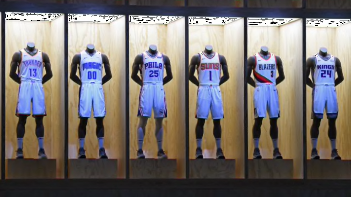
It appears NBA 2K released the Nike City Edition jerseys a bit early, posting them all in an update to the game. The Orlando Magic are heading to space.
In the next few weeks, Nike and the NBA will unveil the final jersey type for the first year of their apparel deal.
The upcoming “City Edition” jerseys are meant to be a representation of the city. Something similar to the “Rip City” jerseys the Portland Trail Blazers wore or the “Motor City” jerseys the Detroit Pistons wore. Many believed they might be similar to the gray Pride jerseys the Orlando Magic wore the last few years or the Stars jersey the Magic wore last year.
Nike seems to be going in a completely different direction.
The first potential images of the Magic’s “City Edition” jersey were leaked onto NBA 2K, along with the 29 other jerseys, Thursday. And as was first reported by SportsLogos.net, the fourth jersey appears to have a space theme.
Take a look at the uniform as spotted on NBA 2K18 (h/t Conrad Burry of SportsLogos.net):

There are definitely a few winners in this bunch and the rest of the 30 City Edition jerseys. There are also a few losers. And the Magic might be one of them.
While it is true the Magic have always incorporated stars into their logo and Central Florida is home to NASA and the space program, putting the Magic logo against a night sky on a jersey seems a bit of a (pun alert) far out concept. And not in a good way.
Maybe the jerseys look better in play as opposed to on paper. But there they are seemingly in the virtual flesh.
Perhaps they are not as bad as the initial mockups. Perhaps there is no way to save them.
It is hard to blame Nike for trying. They had a successful space-themed jersey with the UCF Knights football team earlier this season. On those jerseys, the starry night design limited to a stripe on the helmet. The text inside the UCF logo was the moon. It was a good tribute to the space program and its Central Florida roots. Fans gave the jerseys a warm reception.
This one feels a bit less natural. And maybe a step too far. They tried to do something that worked in one sense and may not quite work in this sense.
In any case, I think there is one good thing that comes out of this jersey design. The black-and-white Magic secondary logo looks really nice. Especially on the hat that will reportedly be released in conjunction with the City Edition jerseys:
Again, the hat via Conrad Burry of SportsLogos.net:

To me, the hat looks a lot better than the jersey itself. So maybe that provides hope that it will look a bit better in person. Or even some of the merchandise surrounding the jersey will be good.
Reportedly, the plan with Nike is to have a different fourth jersey each year. So the Magic may wear these “space” jerseys just for this year and come back with a new jersey next year. It is their 30th anniversary season after all.
Not every jersey with Nike is going to be a winner. But maybe these things will look better in person.
Next: Frank Vogel should experiment with all-defensive lineups
What do you think of the Magic’s potential space uniforms? Let us know in the comment section below or online @omagicdaily!
