NBA fans are getting excited for the eventual switch to Nike this season. One graphic designer online is imagining what Nike’s new jerseys could be.
This season, the NBA will have a new apparel deal. The league will switch from adidas to Nike and it has fans excited, to say the least.
Nike jerseys have been some of the best things to hit the floor in college sports. The designs may be somewhat garish at times — hello, neon — but it gets people talking. And, believe it or not, these jerseys sell and collect buzz.
NBA teams may not need the buzz of college teams. Nike has done well with the NFL’s jersey deals — the Seattle Seahawks’ set is probably the most outlandish although everyone still scratches their head at the Tampa Bay Buccaneers (or, at least I do).
By all accounts, the changes to NBA uniforms this coming season are going to be mostly cosmetic. there are not expected to be any new designs, maybe some slightly different colors or hems and some different material. Nike jerseys have to have that shine.
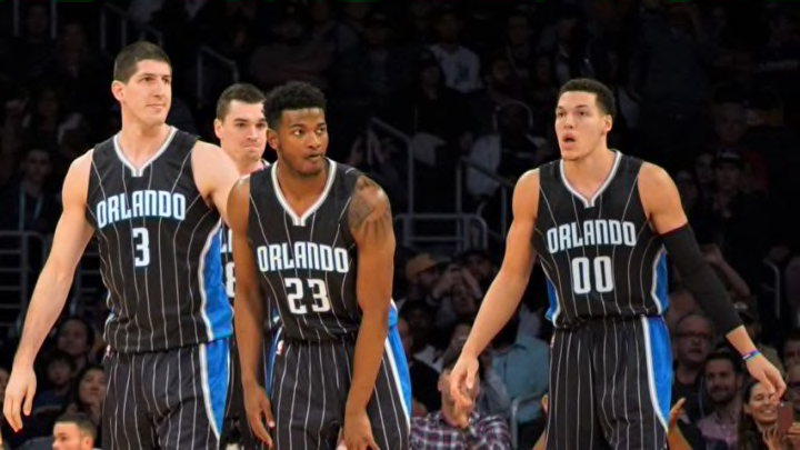
But after that? Everyone is excited to see what Nike might do with some of the alternates around the league in the years to come. adidas is, unfortunately, somewhat known for their lack of creativity — see: the somewhat failed Orlando Magic “Stars” jerseys.
In anticipation of the switchover, online graphic designer Brian Begley has been mocking up jersey sets for several NBA teams, using a refresh of modern looks and throwback jerseys. Some he does not touch at all, some he makes complete redos.
The Magic fell into the complete redo category and it looks like they turned out pretty well.
@NBA @Nike Uniform Design Concepts for the @OrlandoMagic. Designed new logo/wordmarks as well. @BleacherReport @SHAQ #orlando #orlandomagic pic.twitter.com/1cqSA3iAiw
— Brian Begley (@iambrianbegley) July 11, 2017
Gone are the modern pinstripe uniforms, although he preserves the classic blue pinstripes as a third alternate/throwback uniform. This is a complete redesign and there are plenty of elements to like.
First, the black jersey uses the “Stars” design from this year’s black “Stars” uniforms as the design at the bottom of the shorts. This is essentially what those “Stars” uniforms should have been and was a great and unique addition to the style. It is a much better design than what adidas came up with to run out their contract.
He also changes the font the Magic use, but he reintroduces the star as an element in the name. It is not the full “A” like it was in the original uniforms. The uniforms are slick-looking that also seems to hint at a change in the secondary logo with a more compact star and basketball logo.

Orlando Magic
The jerseys look more like a modern update to the original Magic font and logo rather than a throwback to the current block text logo with secondary streaking basketball. The jerseys are both something new and something familiar. It may not be perfect, but it strikes a good balance of past and present, in my opinion.
The alternate black jersey is unique in itself. It was a nice touch for Brian to put the rainbow patch on the shoulder to commemorate the Pulse shooting. The design is very clean and distinct — simple but not too simple.
Certainly, some may have different tastes when it comes to uniform styles. But many fans seem tired of the current modern version of the pinstripe uniforms. The Magic seem overdue for a rebrand. They have worn the current set of jerseys since the 2009 season. With the team trying to turn a leaf to a new era, a new look could be in order.
The Nike jersey change seems like the right time to enact such a design. There is nothing to suggest the Magic will change their jerseys in any significant way. They have a solid set with the pinstripes. But fans have shown their distaste for the sleeved gray “Pride” jerseys and the black “Stars” jerseys. There is hope those will go away now with Nike. But that might be the only immediate change.
The Magic may not go with jerseys that look like this. But thanks to Brian Begley, there is at least an idea of what a rebrand would look like.
Next: How should the Orlando Magic fill their remaining roster spots
What do you think of these jersey designs? What do you want to see if the Magic change their jerseys?
