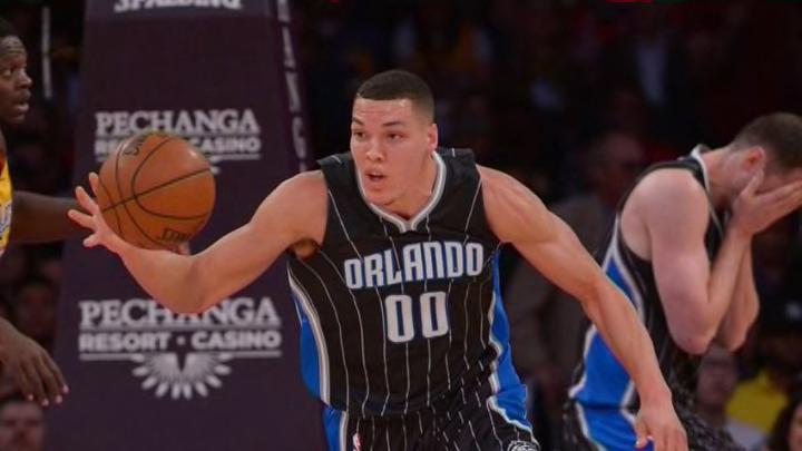
The Orlando Magic announced a new alternate uniform Tuesday with the “Star” uniform, a black jersey with the secondary logo and a horizontal stripe.
The Orlando Magic unveiled a new alternate jersey Tuesday adding to their current set. And the reaction to them has been . . . well, the uniforms are certainly interesting.
Following a recent trend of more logo-centric jerseys, the new alternates are black with the Magic’s secondary streaking ball logo in the middle and a horizontal blue and white stripe cutting across the middle. The number is in upper right chest with blank space on the other side (presumably for the future ad patch).
Get your first look at our brand-new “Stars” jersey, which players will wear during the 2016-17 season! #PureMagichttps://t.co/h6MJ6sWKGM
— Orlando Magic (@OrlandoMagic) August 9, 2016
It does indeed look like a Polo shirt with that stripe across the middle.
The jersey will be added to the team’s current set of uniforms — the traditional home white and road blue, the alternate black jersey and the gray Pride jerseys.
The Magic collaborated with adidas to make the uniform featuring the latest sweat-wicking technology. The jerseys are also made from 60 percent recycled materials. So at least it has that going for it.
The Magic’s statement about the uniforms said they hope the uniforms pay homage to the stars that used to adorn their logo and their jersey through the use of the secondary logo front and center.
“The ‘star’ of the new jersey remains the ball swoosh placed front and center, serving as the focal point,” the team wrote in a press release. “Along the hem of the shorts, the iconic star also makes a return to the uniform. The jersey and the stars represent teamwork, tradition and toughness – the pillars of the past and the fight of the future.”
Maybe judgment needs to be reserved until they are seen in action, but these are not looking so good. It just feels very busy with the full logo in the center and the horizontal stripe. Kudos for trying something that has not been done in the NBA yet.
But the full logo in the center evokes too many memories of the classic 1990s jerseys — such as the Houston Rockets and Toronto Raptors. Just without any of the nostalgia. The number in the upper corner is a growing trend in the NBA and just seems awkwardly placed.
The @OrlandoMagic unveiled their new alternate "#Stars" jersey.#VNdesign pic.twitter.com/RNmj9bhx0d
— VN Design (@vndsgn) August 9, 2016
It just looks like a practice jersey more than a game jersey.
The black design does look nice though. Maybe if the horizontal stripe went all the way around uninterrupted similar to the Washington Wizards’ current uniforms, it might work better.
This just does not feel like a Magic jersey. The Magic jerseys that have worked have been the pinstripe uniforms. If not those than the ones with the in-laid stars like from the early 2000s.
These jerseys just do not seem to be right. Credit goes to trying something different, and maybe they will look better when the pants are unveiled. But it lacks the feeling of a game jersey at the moment.
That is probably the big criticism for the sleeved jerseys. They just do not look like game jerseys.
It feels like there is a lot of empty space for the bottom of the jersey. It seems like something is missing.
And, yes, the empty space on the left chest is prime real estate for an ad patch when they are allowed.
It should also be noted, this is the final year of the NBA’s apparel agreement with adidas. This will likely be the only season the Magic wear these uniforms as the NBA switches over to Nike for the 2018 season.
Again, they may look better when the complete set is unveiled. And the black material looks great. It is a good look for the Magic to make black a primary alternate color again — like the original jerseys, blue has been the primary road jersey color since the 1996 season.
The Magic will debut the jerseys during the 2017 season and wear them on select dates. The NBA schedule is expected to be released later this week.
Next: CBS ranks Orlando Magic bench low too
The jerseys will be available for sale through an exclusive team pre-sale on the Orlando Magic’s official app beginning Oct. 1. Each fan who purchases a jersey will receive two tickets to a Magic preseason game.
