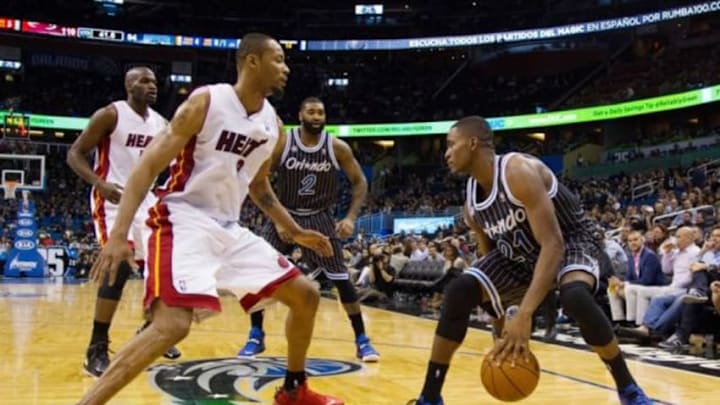
Grantland NBA scribe Zach Lowe ranks the Orlando Magic logo No. 19 in the league. The simple logo seems to be ranked about right.
The Orlando Magic logo is admittedly not a work of art.
It is extremely plain, in fact. The font is relatively boring and there is no artistic flourish to it. There is really nothing unique or iconic about it. Not since the Magic got rid of the “Star A” in the logo and reverted only to its secondary streaking ball logo as the only flourish to have anything other than words.
Simplicity can be good though. There is no ornateness or cartoonishness (hello Houston Rockets) and no potential for something that looks really ugly.
Something simple that is good can be really good.
That seems to be the lesson Zach Lowe of Grantland teaches us as he ranked the NBA’s 30 team logos, using his own personal tastes and some basic sense of style and understanding of the reasoning behind each logo.
Recognizing how difficult it is to create a solid logo for something as abstract as “magic” something too simple might be all the Magic can do to create something that is not a laughing stock. So their No. 19 ranking in Lowe’s list seems about right:
"Here’s a challenge: create a visual representation for the concept of “magic,” incorporate basketball, and somehow avoid making it corny. The Magic have done that with the comet ball, which flies downward as if it were about to drop through the net. I’ve always liked that mark.The straight font, unveiled in 2010, is almost too serious to back such a joyful image. The old stylized font, which used stars for the “a” in Magic and the dot of the “i,” trod toward camp, but it made for a better fit with that starry ball."
As we learned earlier this summer, designing a logo for the Magic is not an easy task. It seems we go through this exercise every year with some attempt to redesign the Magic’s logo. And it is tough to do much better for many fans than the original logo. Unfortunately, if the Magic wanted to go back to that, they might have to come up with a unique twist to it as the league protects what it calls “legacy designs.”
As far as simplicity and iconic goes, there may not be a better look for the Magic than what they originally came up with. And it looks so good on a basketball court too.
My hypothesis on the Magic’s redesign from before the 2011 season to their current logo is the team wanted a less cartoonish and more “adult” look as they moved into their new stadium. The plainness of the logo really suggested to me that the organization was looking for a seriousness.
From a sales standpoint, the logo is not really distinctive enough to move merchandise. But really, the Magic have been selling merchandise off their secondary logo for the better part of the 2000s since switching off their original logo in 1999.
It is probably not time for a fresh look yet (expect it perhaps when the Magic make a clearer turn toward relevance like they did with their last jersey redesign before the 2009 season). But Magic fans I have talked to definitely want something a bit more iconic and noticeable.
Then again, as Lowe points out, simplicity often wins. And it is difficult to balance smart design with too much cartoonishness.
His number one logo was the Chicago Bulls’ logo which has gone virtually unchanged in the team’s existence. And, frankly, the only way to build tradition and make a mark iconic is to win with it and make everyone remember it.
What do you think of the Magic’s logo? Is Lowe’s ranking too high or too low? What improvements would you make?
